Visualize server resources using InfluxDB and Grafana
I was making an application that was painful to munin and made a kettle with fabric, but it became painful in the graph drawing part, and as a result of various investigations, the combination of InfluxDB and Grafana seemed to be good, so I visualized the resources nicely. The content that I tried.
Overview
There is a monitoring server and a group of monitored servers, and InfluxDB, Grafana, and Fabric are installed on the monitoring server. The monitoring server uses Fabric to ssh each server and get metrics. The acquired metric is saved in InfluxDB and visualized in Grafana. Feeling like that.
Versions
I used CentOS as the OS, but it seems that the installation and startup of InfluxDB and Grafana are different. InfluxDB = 0.8.8(stable) Grafana = 2.0.1 Fabric = 1.10.1 influxdb-python = 2.2.0
Install & Launch
Since the official installation is correct, just execute it.
By default, ports 8083, 8086, 8090, 8099 are used, so open them if necessary. ʻUlimit -n 65536` raises the upper limit of the number of file descriptors.
wget http://s3.amazonaws.com/influxdb/influxdb-latest-1.x86_64.rpm
sudo rpm -ivh influxdb-latest-1.x86_64.rpm
sudo service influxdb start
By default, port 3000 is used, so open it if necessary.
wget install https://grafanarel.s3.amazonaws.com/builds/grafana-2.0.2-1.x86_64.rpm
sudo rpm -ivh grafana-2.0.2-1.x86_64.rpm
sudo service grafana-server start
Used to get metrics from each server. If you can get the numbers from each server and save them in InfluxDB, you don't have to use Fabric. Right now, I'm wondering if a tool called Diamond looks good. Install Fabric from the Python packaging system. (It doesn't work unless it's 2.x Python)
sudo pip install Fabric
This is also installed with pip. You don't need to use Fabric.
sudo pip install influxdb
Setting
Both InfluxDB and Grafana can access the web interface. Please do various things for each user.
InfluxDB
Create a DB to save the metrics.
When you access http: // localhost: 8083 /, you will be asked to log in, so log in with ʻuser = root, password = root`.

When you log in, the database list is displayed.
Create a new database called dimensions that stores the measured values obtained from each server.

Connection between Grafana and InfluxDB
If you access http: // localhost: 3000 /, you will also be asked to log in. By default, you can log in with ʻuser = admin, password = admin`.

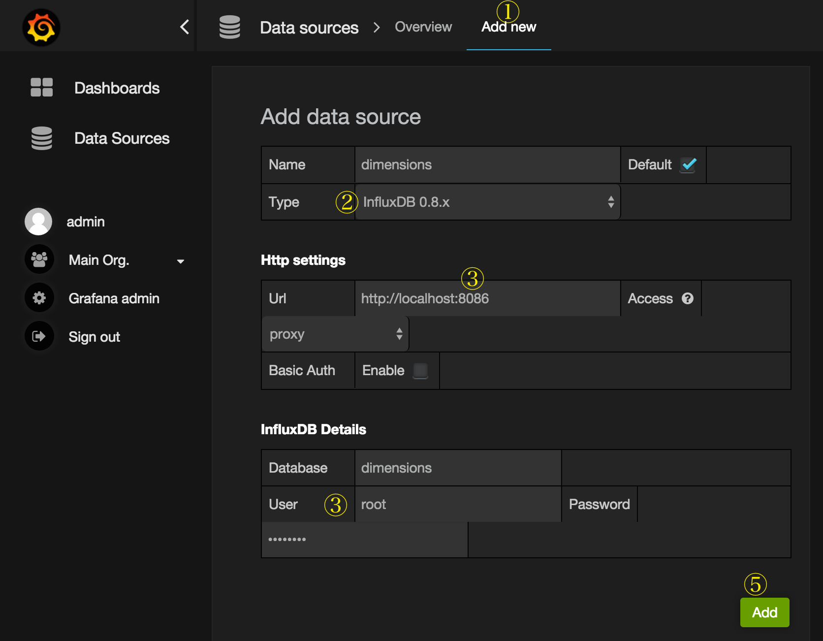
Empty dashboard. Click the Grafana mark on the upper left to open the menu. Click Data Sources in the menu to open the Grafana backend setting screen.

After clicking Data Sources, click Add new in the center of the screen and set InfluxDB 0.8.x as the backend. Note that the url port is the api port, so specify 8086 instead of the browser 8083. Name is appropriate. Database sets the dimensions created by InfluxDB earlier. Finally, click Add to complete.

This completes the connection between Grafana and InfluxDB.
Fabric
Get metrics from each server and save them in InfluxDB. For details on how to use it, please see it on other pages.
fabfile.py
#!/usr/bin/env python
# -*- coding: utf-8 -*-

from fabric.api import env, run
from influxdb.influxdb08 import InfluxDBClient
import re

env.hosts = ["server01.hoge.jp"]
env.key_filename  = ["~/.ssh/server01_rsa"]
env.user = "myuser"
client = InfluxDBClient('localhost', 8086, 'root', 'root', 'dimensions')

def loadaverage():
    match = re.search(r"load averages?:\s+(\d+\.\d+),\s+(\d+\.\d+),\s+(\d+\.\d+)", run("uptime"))
    min1  = float(match.group(1))
    min5  = float(match.group(2))
    min15 = float(match.group(3))
    client.write_points([
        {
            "name": "loadaverage_1min",
            "columns": ["value"],
            "points": [[min1]]
        },
        {
            "name": "loadaverage_5min",
            "columns": ["value"],
            "points": [[min5]]
        },
        {
            "name": "loadaverage_15min",
            "columns": ["value"],
            "points": [[min15]]
        }
    ])
Prepare a fabfile like this and run it with crontab every minute.
*/1 * * * * fab loadaverage
After a few minutes, I throw a query with list series from the Influx DB dimensions DB web interface and when 3 series are returned, it's ok. By the way, series is like a table in RDB.

Visualization with Grafana
Select New from the dashboard menu.

You will be taken to a new dashboard, so open the menu from the green part and create a new graph.

Click the title of the graph (where it says no title (click here)) and use edit to open the graph setting screen.
If you enter load average_1min in series, a graph will appear (!). Set group by time to 1m.
Then press Add query to add the query and add the load average_5min and load average_15min settings in the same way.
It's even better to set alias and graph titles nicely. By the way, if the series name is separated by dots, each field separated by dots by alias is assigned to \ $ 0, \ $ 1 ..., so variables can be used.
In this area, I feel that it is easier to set than kibana, which is the original fork (settings are also reflected in real time).

You can set the maximum time to be displayed on the graph and the time for real-time update from the time display on the upper right. Finally, click Save to complete the dashboard.
After that, it feels like boiling or baking.

Summary
Time series management and graphing of metric data, which was difficult to make personally, was very easy with InfluxDB and Grafana. I'm looking forward to the 1.0 release of InfluxDB, but it seems that there is not much compatibility between 0.8 and 0.9, so it will be painful. Grafana is a clone of kibana, so it's great to be able to create a dashboard with even better operability while keeping the cool appearance. Also, I just wanted to visualize it with Kibana, but it was quite painful to have Elasticsearch, but Grafana is sober that I can choose the type of backend. Since neither Fabric nor Diamond compete with each other, it seems better to use Diamond for load average and general metrics, and Fabric for more application-oriented metrics. In addition to the graph display I wrote this time, the dashboard also has a single stat, so you can do things like just display the current status. It seems that you can add annotations and make things like this in the graph.