[SWIFT] Animation using matchedGeometryEffect and @Namespace
API added in Swift UI 2.0
Among the new features added in SwiftUI 2.0, there was an API that makes it easy to create Hero animations, so I touched it for a moment.
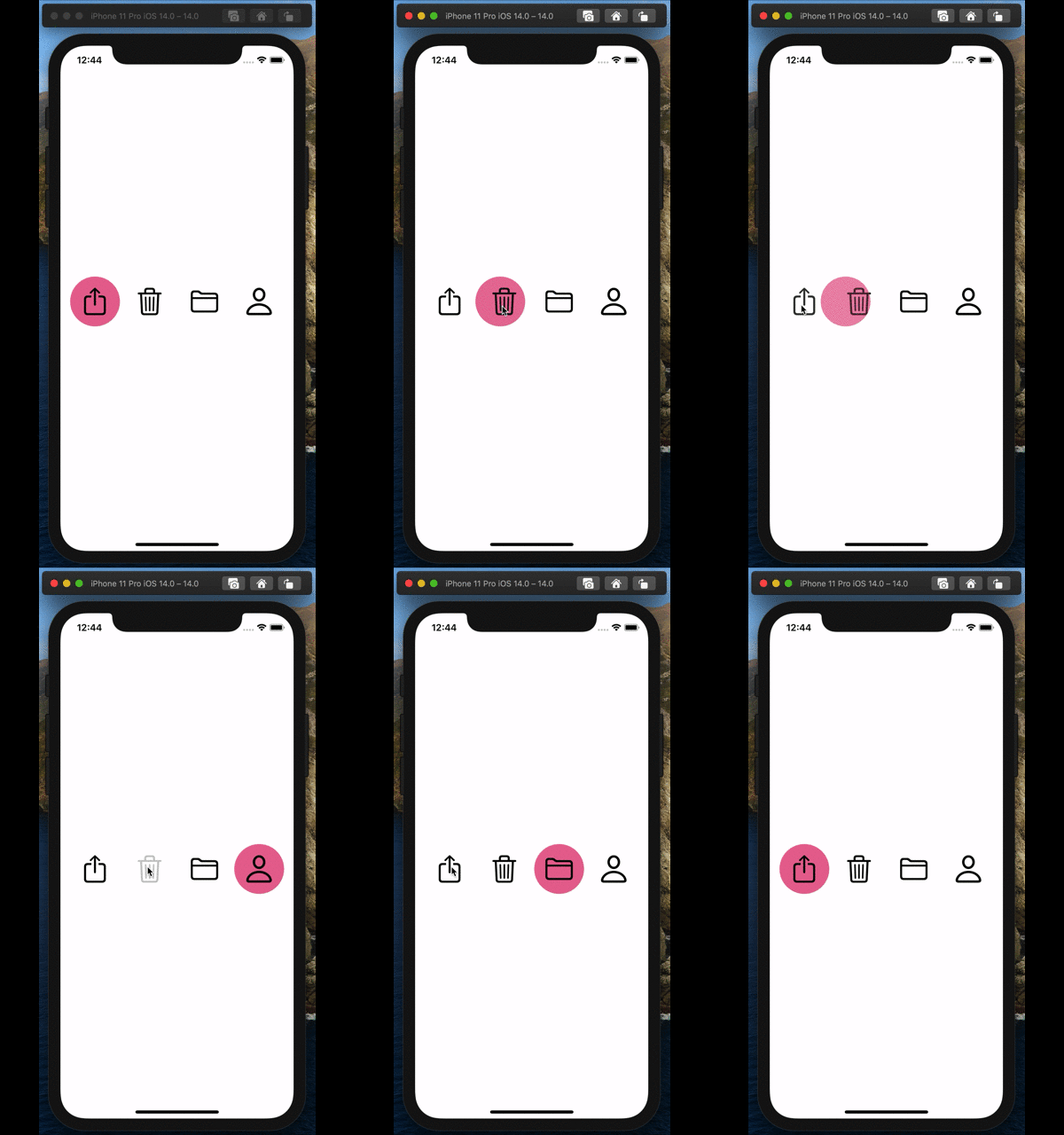
Completed form for the time being
Let's create a Segment Control-like UI like this.
Github is here. https://github.com/hoshi005/matched-geometry-animation

Development environment
- Xcode 12.0.1
- iOS 14.0.1
Make a button
Create a View of the buttons used for selection. Before that, I defined the enum appropriately. About 4 are selected from SF Symbols.
enum ButtonType: String, CaseIterable {
    case share = "square.and.arrow.up"
    case trash = "trash"
    case folder = "folder"
    case person = "person"
}
The button view is created like this. For AccentColor, define your favorite color in Assets as appropriate.
struct CustomButton: View {
    //Property that represents the selected state.
    @Binding var selected: ButtonType
    //Your own button type.
    let type: ButtonType

    var body: some View {
        ZStack {
            //Draw a circle on the background if selected.
            if selected == type {
                Circle()
                    .fill(Color.accentColor) //AccentColor should be defined in Assets.
            }

            Button(action: {
                selected = type //Tap the button to switch the selection to yourself.
            }, label: {
                //View image from enum.
                Image(systemName: type.rawValue)
                    .resizable()
                    .renderingMode(.original)
                    .aspectRatio(contentMode: .fit)
                    .frame(width: 44, height: 44)
            })
        }
        .frame(width: 80, height: 80)
    }
}
Let's check the appearance depending on whether it is selected or not. The preview looks like this.
struct ContentView_Previews: PreviewProvider {
    static var previews: some View {
        Group {
            CustomButton(selected: .constant(.share), type: .share) //Selected state.
            CustomButton(selected: .constant(.trash), type: .share) //Unselected state.
        }
        .previewLayout(.fixed(width: 100, height: 100))
    }
}

Arrange the buttons on the screen
Let's arrange the buttons on the screen
struct ContentView: View {

    @State private var selected = ButtonType.share //Initial value of selected state.

    var body: some View {
        HStack {
            //Turn the enum with foreach and arrange the Custom Buttons side by side.
            ForEach(ButtonType.allCases, id: \.self) { type in
                CustomButton(selected: $selected, type: type)
            }
        }
    }
}
The preview looks like this
struct ContentView_Previews: PreviewProvider {
    static var previews: some View {
        Group {
            ContentView()
            Group {
                CustomButton(selected: .constant(.share), type: .share)
                CustomButton(selected: .constant(.trash), type: .share)
            }
            .previewLayout(.fixed(width: 100, height: 100))
        }
    }
}
Let's move it.
 By switching the selection state, the appearance has also changed.
Now let's add animations from here.
Animate
First of all, we will modify some behavior when the button is tapped so that the state change when the button is selected is accompanied by animation.
//Excerpt.

Button(action: {
    //Pass the processing at the time of button tap to the closure of the withAnimation method.
    withAnimation {
        selected = type
    }
}, label: {
    //View image from enum.
    Image(systemName: type.rawValue)
        .resizable()
        .renderingMode(.original)
        .aspectRatio(contentMode: .fit)
        .frame(width: 44, height: 44)
})
Set .matchedGeometryEffect
Specify .matchedGeometryEffect for the View you want to animate.
It's like grouping the animations you want to sync by giving them an identifier and a Namespace.
First, declare the namespace.
struct CustomButton: View {
    //abridgement

    var namespace: Namespace.ID //Add namespace.

    //abridgement
}
Then specify .matchedGeometryEffect for the background view you want to animate.
//Draw a circle on the background if selected.
if selected == type {
    Circle()
        .fill(Color.accentColor) //AccentColor should be defined in Assets.
        //The identifier can be anything as long as it matches between the groups you want to sync the animation with..
        .matchedGeometryEffect(id: "CustomButton", in: namespace)
}
Next, make modifications to the calling View side
struct ContentView: View {

    @State private var selected = ButtonType.share

    //Declare namespace using @Namespace property wrapper.
    @Namespace var namespace

    var body: some View {
        HStack {
            ForEach(ButtonType.allCases, id: \.self) { type in
                //Modify to give namespace to argument.
                CustomButton(selected: $selected, type: type, namespace: namespace)
            }
        }
    }
}
That's it! It's very easy to do!
The preview will work if you modify it like this
struct ContentView_Previews: PreviewProvider {
    @Namespace static var namespace //Don't forget static.
    static var previews: some View {
        Group {
            ContentView()
            Group {
                CustomButton(selected: .constant(.share), type: .share, namespace: namespace)
                CustomButton(selected: .constant(.trash), type: .share, namespace: namespace)
            }
            .previewLayout(.fixed(width: 100, height: 100))
        }
    }
}
Summary
Hero animation is exciting, so I'd like to try various other things.