Japanese settings for matplotlib and Seaborn axes
If you want to draw a graph in Python for the time being, you will probably use matplotlib. However, there are too many configuration APIs to decide which one to use, and the default color palette seems to be unsatisfactory. Seaborn can be used to solve some of these challenges. The following article will be helpful for specific examples.
-Beautiful graph drawing with python -Data analysis and visualization progress with seaborn Part 1 --Qiita -Beautiful graph drawing with python -Data analysis and visualization progress with seaborn Part 2 --Qiita
In the case of pure numerical calculation, the vertical and horizontal axes are often numbers and dates, but depending on the data set, Japanese may be handled. Font settings are required to use Japanese for labels and text. Several articles may be helpful on this issue.
-Japanese with matplotlib --Qiita -Draw a graph using Japanese labels with Jupyter --Qiita -[Seaborn] Display Japanese (change font) --Qiita
So what is your environment after all? There are many things that I think, so I made it possible to display a confirmation notebook with nbviewer. The environment is based on Docker's jupyter / datascience-notebook and [IPA font](http://ipafont.ipa. go.jp/) is placed. The principle is the same for other fonts and platforms.
matplotlib.font_manager has FontManager and FontProperties classes. By combining these, you can check the list of fonts that are valid on the current platform, and if the Japanese font you want to target is valid, it seems that it is the shortest to enable it globally with set () of Seaborn.
List of valid fonts
Get the list of fonts via * font_manager *, refill it in a data frame, and then perform a conditional search.
Module import
import matplotlib.font_manager as fm
import pandas as pd
List of fonts
fonts = fm.findSystemFonts()
# len(fonts) =>There should be more than 100
Packing into a data frame
l = []
for f in fonts:
    font = fm.FontProperties(fname=f)
    l.append((f, font.get_name(), font.get_family()))
df = pd.DataFrame(l, columns=['path', 'name', 'family'])
Confirmation that IPA font exists
df[df['path'].apply(lambda s: 'IPA' in s)]
You should get an output like this.
| index | path | name | family |
|---|---|---|---|
| 82 | /usr/share/fonts/truetype/IPAfont00303/ipagp.ttf | IPAPGothic | [sans-serif] |
| 108 | /usr/share/fonts/truetype/IPAfont00303/ipamp.ttf | IPAPMincho | [sans-serif] |
| 138 | /usr/share/fonts/truetype/IPAfont00303/ipam.ttf | IPAMincho | [sans-serif] |
| 236 | /usr/share/fonts/truetype/IPAfont00303/ipag.ttf | IPAGothic | [sans-serif] |
The font file has been copied to the Docker container in advance. Download and unzip the ZIP file manually.
Copy font file
$ docker exec notebook cp -r /dataset/IPAfont00303 /usr/share/fonts/truetype
Drawing a graph
Let's draw a graph using matplotlib and Seaborn APIs respectively.
Module import
%matplotlib inline
import matplotlib.pyplot as plt
import seaborn as sns
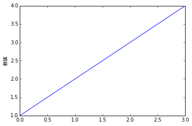
The label on the vertical axis is set with * ylabel () *. This function takes the same optional keyword arguments as * text () *. If you check matplotlib.pyplot.text, you can see that it can be overwritten with the dictionary * fontdict *.
Set Japanese font for label on vertical axis
plt.plot([1,2,3,4])
plt.ylabel('Numerical value', fontdict={'family': 'IPAPGothic'})
plt.show()

- ylabel () * can also accept matplotlib.text.Text as a keyword argument. It receives * fontproperties * and * rotation * for finer control. Setting up these overloads is a confusing part, and it also inherits matplotlib.rcParams. Although it is possible to make detailed settings in some parts, it is undeniable that it is difficult to stick to.
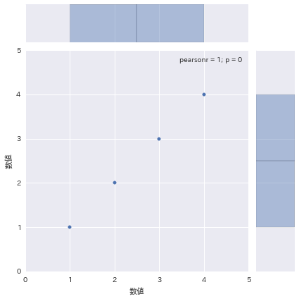
Then draw the graph in Seaborn. Use seaborn.axes_style for the axis style. This function can also be used with the with statement. That is, you can set the style for each graph.
However, in reality, it is more likely that you will use the same style in one notebook seaborn.set. You will use .set). It will propagate what you specify in the * font * attribute to the axis settings.
set()Call and draw with Seaborn
data = pd.DataFrame([1, 2, 3, 4], columns=['Numerical value'])
sns.set(font=['IPAPGothic'])
sns.jointplot(x='Numerical value', y='Numerical value', data=data, xlim=(0, 5), ylim=(0, 5))

I think there are good and bad things, but the Seaborn setting also overwrites the matplotlib setting. If you draw from matplotlib in the same notebook as before, but with no fonts set, the Japanese axis will be displayed normally. This may be useful when you want to switch the styles of existing graphs all at once.
set()Draw with matplotlib after calling
plt.plot([1,2,3,4])
plt.ylabel('Numerical value')
plt.show()

Recommended Posts