3D display with plotly
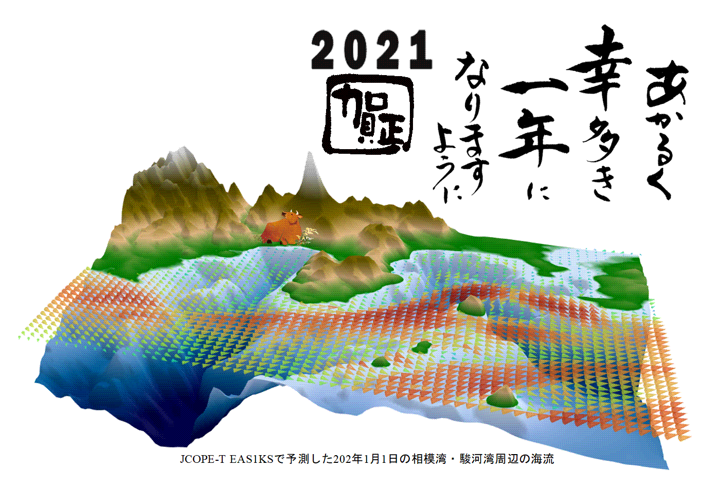
In the central figure of this year's New Year's card, the flow velocity of the ocean prediction model is displayed together with the 3D topography.

[plotly]
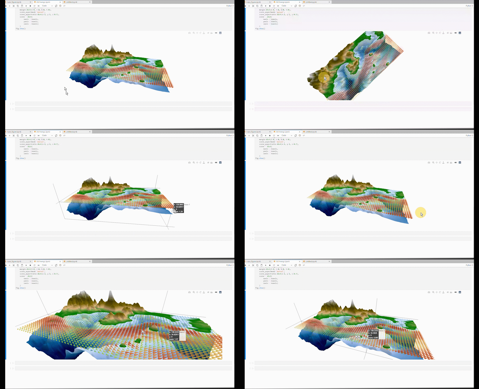
Created with (https://plotly.com/python/). You can also move it around on the Jupyterlab.

The part to read the data is omitted, and the code of the part to draw the figure is as follows. Where go.Surface draws the terrain three-dimensionally, x is the x-axis, y is the y-axis, and the terrain data is in z. Ctopo is a color scale for coloring. The part where go.Cone expresses the flow velocity vector with a three-dimensional cone. (xv, yv, zv) contains 3D coordinates, and (uv, vv, wv) contains 3D vector data. In layout, the aspect ratio of the figure is changed and the coordinate axes are not displayed.
import plotly.graph_objects as go


Ctopo = [[0, 'rgb(0, 0, 70)'],[0.2, 'rgb(0,90,150)'],
          [0.4, 'rgb(150,180,230)'], [0.5, 'rgb(210,230,250)'],
          [0.50001, 'rgb(0,120,0)'], [0.57, 'rgb(220,180,130)'],
          [0.65, 'rgb(120,100,0)'], [0.75, 'rgb(80,70,0)'],
          [0.9, 'rgb(200,200,200)'], [1.0, 'rgb(255,255,255)']]

fig = go.Figure(data=[go.Surface(z=z, x=x, y=y,showscale=False,colorscale=Ctopo,cmin=-3000,cmax=3000),
                      go.Cone(x=xv,y=yv,z=zv,u=uv,v=vv,w=wv,sizemode="absolute",sizeref=0.05,colorscale="turbo",opacity=0.5,cmin=0,cmax=1.5,showscale=False)])


noaxis=dict(showbackground=False,
            showgrid=False,
            showline=False,
            showticklabels=False,
            ticks='',
            title='',
            zeroline=False)


fig.update_layout(
    width=1500, height=500,
    margin=dict(l=0, r=0, b=0, t=0),
    scene_aspectmode='manual',
    scene_aspectratio=dict(x=2, y=1, z=0.7),
    scene = dict(
        xaxis = noaxis,
        yaxis = noaxis,
        zaxis = noaxis)
    )
fig.show()
Recommended Posts