I tried to summarize how to use matplotlib of python
Introduction
This time I will summarize how to use matplotlib.
Many people have summarized how to use matplotlib, so it may not be new, but I would appreciate it if you could get along with me.
The previous article summarized how to use numpy and pandas, so please check it if you like.
I tried to summarize python numpy I tried to summarize how to use pandas in python
In writing this article, the following articles were very helpful.
About the style of matplotlib
There are two styles of matplotlib.
A Pyplot interface that can be done with all plt. Somehow, and an object-oriented interface that is written with ʻax.plot after defining fig and ʻax.
Let's see a concrete example.
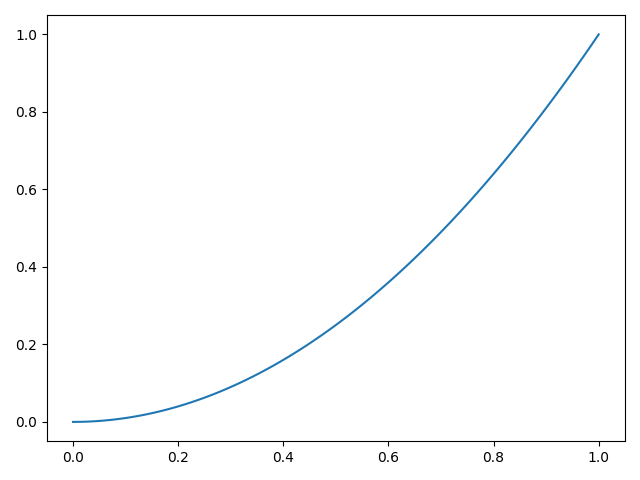
Pyplot interface
import numpy as np
import matplotlib.pyplot as plt

x = np.linspace(0, 1, 100)
y = x ** 2
plt.plot(x, y)
plt.show()

Object-oriented interface
x = np.linspace(0, 1, 100)
y = x ** 2
fig = plt.figure()
ax = fig.add_subplot(111)
ax.plot(x, y)
plt.show()
When using an object-oriented interface, you need to understand the following hierarchical structure.
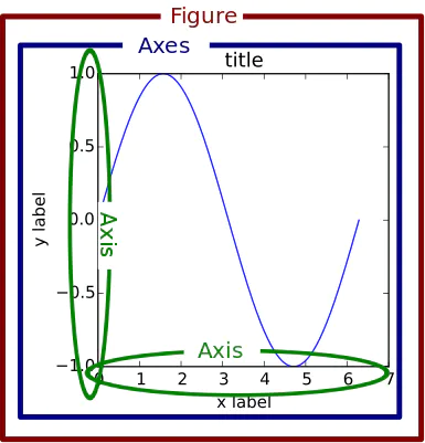 As you can see, there is a hierarchical structure in which the ʻAxes object
 exists inside the figure object. That is, the above code creates a figure object with fig = plt.figure ()and an axes object with ʻax = fig.add_subplot (111).
As an image, remember that the figure object is like a browser window and the axes object is like a browser tab.
Draw multiple graphs
When drawing multiple graphs, do as follows.
x_1 = np.linspace(0, 1, 100)
y_1 = x_1
x_2 = np.linspace(0, 1, 100)
y_2 = x_2 ** 2
x_3 = np.linspace(0, 1, 100)
y_3 = x_3 ** 3
x_4 = np.linspace(0, 1, 100)
y_4 = x_4 ** 4
fig = plt.figure()

ax_1 = fig.add_subplot(221)
ax_2 = fig.add_subplot(222)
ax_3 = fig.add_subplot(223)
ax_4 = fig.add_subplot(224)

ax_1.plot(x_1, y_1)
ax_2.plot(x_2, y_2)
ax_3.plot(x_3, y_3)
ax_4.plot(x_4, y_4)

plt.show()
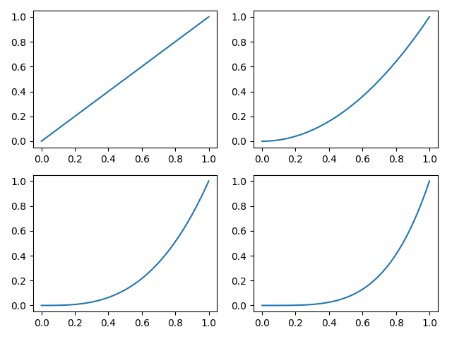
Four axis objects are created in one figure object.
The argument of ʻadd_subplot ()is(row, column, number)`, and in the above example, data of 2 rows and 2 columns is generated, and axes objects are generated in order.
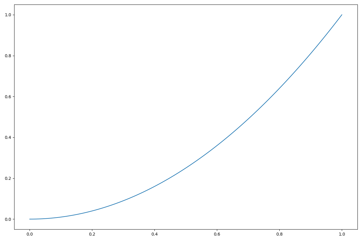
Adjusting the size of the graph
When you create a figure object, you can adjust the size of the graph by passing figsize as an argument.
x = np.linspace(0, 1, 100)
y = x ** 2
fig = plt.figure(figsize=(12, 8))
ax = fig.add_subplot(111)
ax.plot(x, y)
plt.show()
Generate figure and ax objects at the same time
Until now, a figure object was created and then an ax object belonging to it was created, but you can create a figure object and an ax object at the same time as shown below.
fig, axes = plt.subplots(2, 2, figsize=(20, 12))
plt.show()
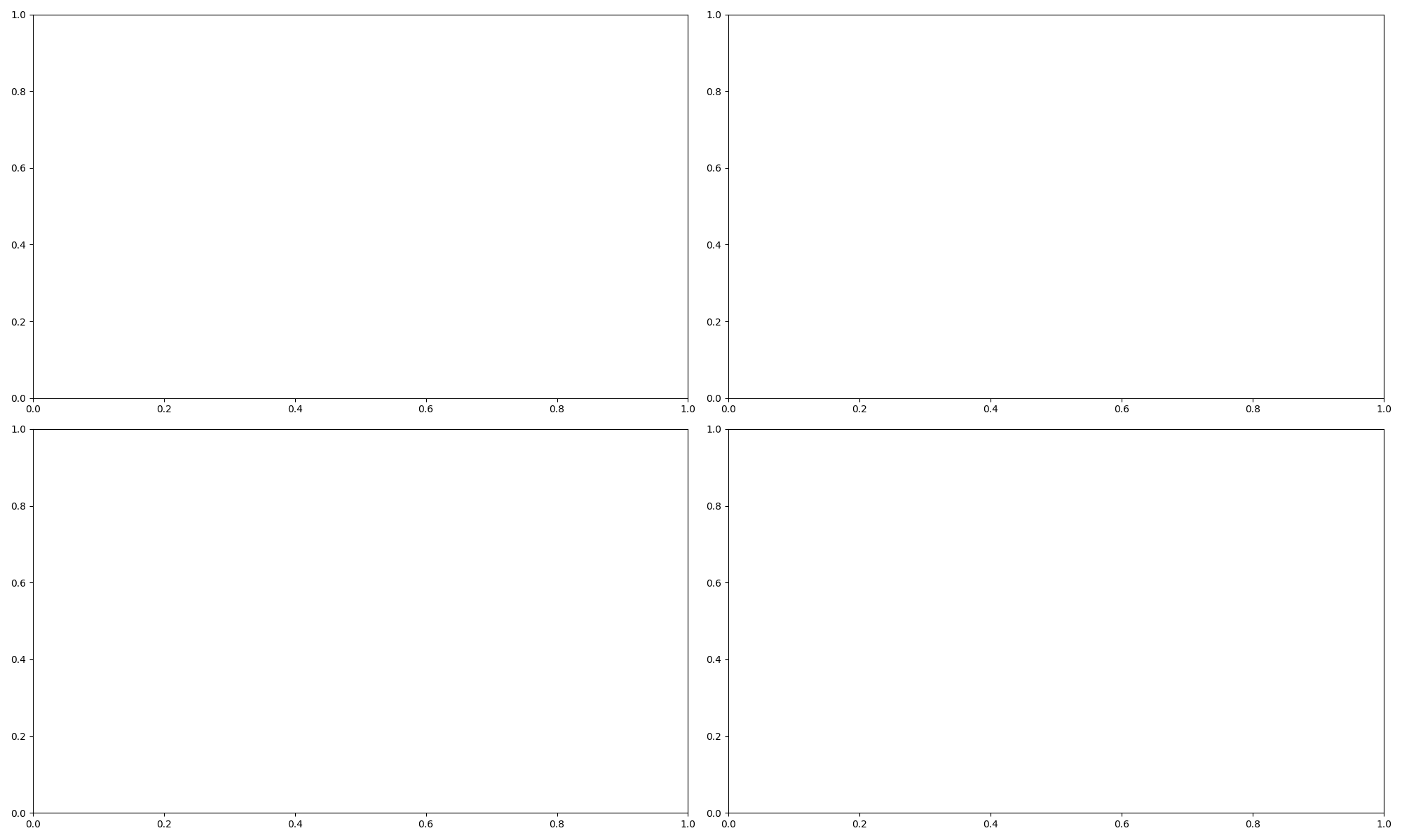
Since we haven't plotted anything yet, we've created an empty box like the one above. Let's take a look at the contents of the data.
print(axes)
print(axes.shape)
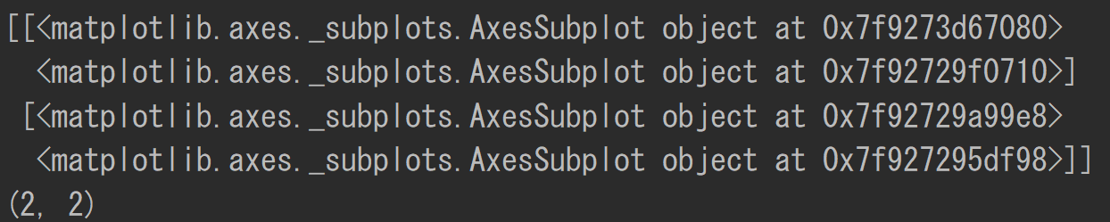
As you can see, the axes object contains 2x2 data. Each one corresponds to the above four graphs.
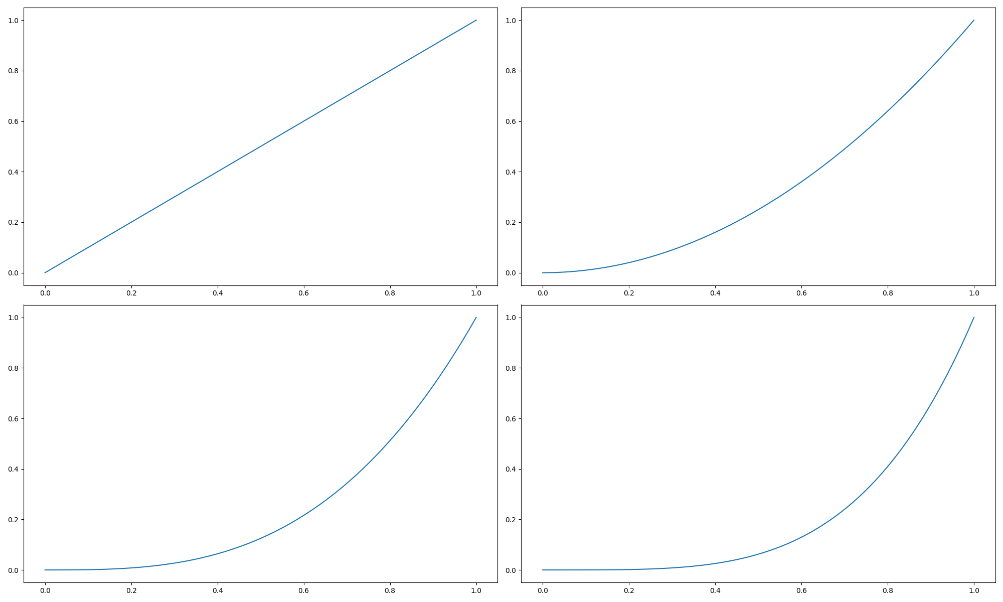
You can plot it as follows:
x_1 = np.linspace(0, 1, 100)
y_1 = x_1
x_2 = np.linspace(0, 1, 100)
y_2 = x_2 ** 2
x_3 = np.linspace(0, 1, 100)
y_3 = x_3 ** 3
x_4 = np.linspace(0, 1, 100)
y_4 = x_4 ** 4
fig, axes = plt.subplots(2, 2, figsize=(20, 12))
axes[0][0].plot(x_1, y_1)
axes[0][1].plot(x_2, y_2)
axes[1][0].plot(x_3, y_3)
axes[1][1].plot(x_4, y_4)

plt.show()
Convert axes to a one-dimensional array
Since axes are two-dimensional data, it is difficult to turn with a for statement.
Converting to a one-dimensional array using ravel () makes it easier to turn in a for statement. See the example below.
fig, axes = plt.subplots(2, 2, figsize=(20, 12))
one_dimension_axes = axes.ravel()
x = np.linspace(0, 1, 100)
for i, ax in enumerate(one_dimension_axes):
    ax.plot(x, x ** (i+1))

plt.show()

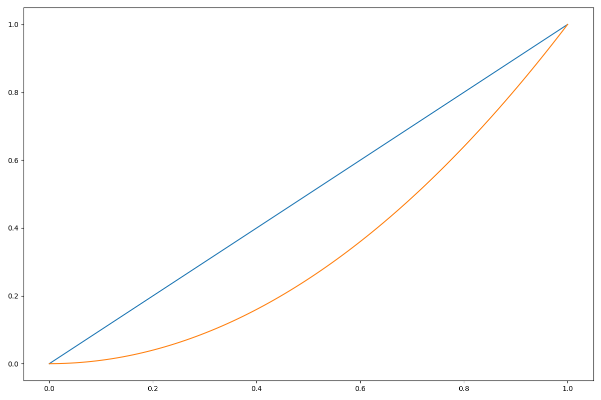
Draw multiple lines
You can draw multiple lines by plotting on the same ax object.
fig = plt.figure(figsize=(12, 8))
ax = fig.add_subplot(111)
x_1 = np.linspace(0, 1, 100)
y_1 = x_1
x_2 = np.linspace(0, 1, 100)
y_2 = x_2 ** 2
ax.plot(x_1, y_1)
ax.plot(x_2, y_2)
plt.show()
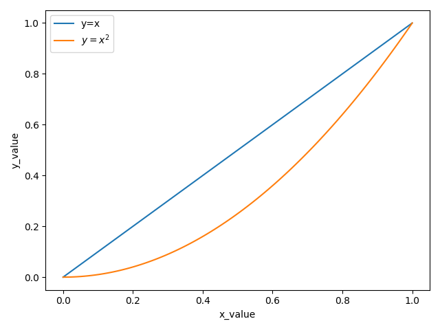
Set the title, axis, and legend.
fig = plt.figure()
ax = fig.add_subplot(111)
x_1 = np.linspace(0, 1, 100)
y_1 = x_1
x_2 = np.linspace(0, 1, 100)
y_2 = x_2 ** 2
ax.plot(x_1, y_1, label='y=x')
ax.plot(x_2, y_2, label='$y=x^2$')
ax.set_xlabel('x_value')
ax.set_ylabel('y_value')
plt.legend(loc='best')
plt.show()
You can also create a label using plt.xlabel etc., but this time I set the label using set_xlabel to indicate that the label belongs to the axes object.
The label is stored in the axis object under the axes object.
Let's create an axis object and check the label variable in it.
xax = ax.xaxis
yax = ax.yaxis
print(xax.label)
print(yax.label)
Text(0.5, 0, 'x_value') Text(0, 0.5, 'y_value')
Change line color / thickness / style
Please refer to the article here for colors.
fig = plt.figure()
ax = fig.add_subplot(111)
x_1 = np.linspace(0, 1, 100)
y_1 = x_1
x_2 = np.linspace(0, 1, 100)
y_2 = x_2 ** 2
ax.plot(x_1, y_1, label='y=x', color='r', linewidth=2, linestyle='solid')
ax.plot(x_2, y_2, label='$y=x^2$', color='g', linewidth=2, linestyle='dashed')
ax.set_xlabel('x_value')
ax.set_ylabel('y_value')
plt.legend(loc='best')
plt.show()
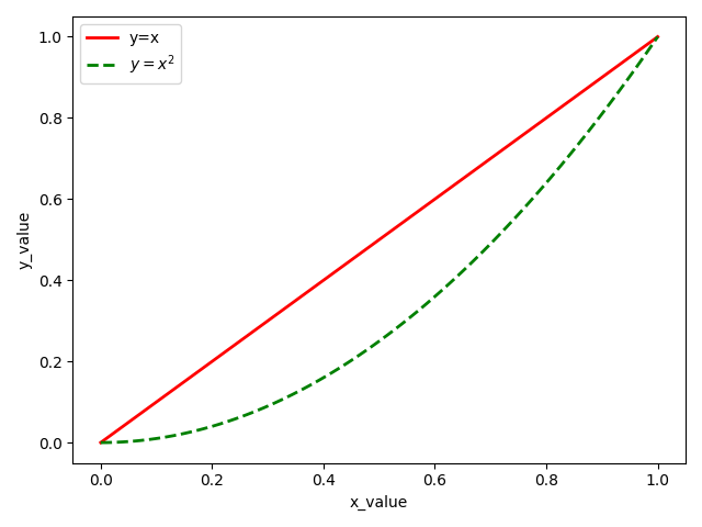
You can change the color and style by specifying the argument of ʻax.plot` as described above.
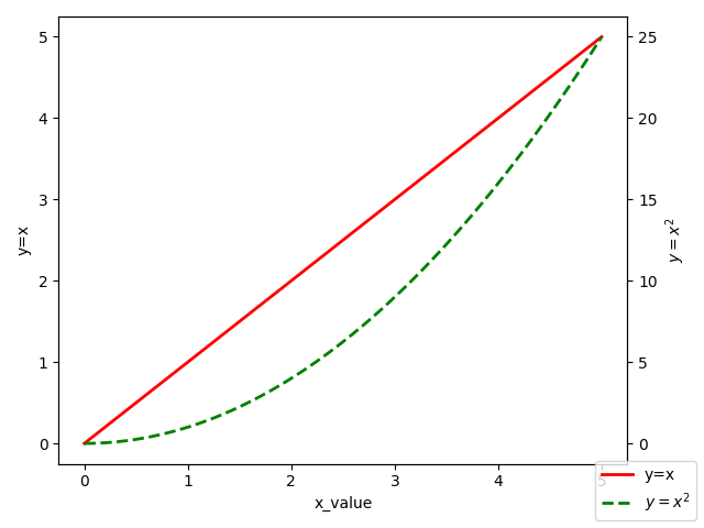
How to draw a graph with two axes on the left and right
The first plot can be drawn in the usual way, and the second plot can be drawn with ax generated using twinx () to draw a graph with a common x-axis and a different y-axis.
fig = plt.figure()
ax_1 = fig.add_subplot(111)
ax_2 = ax_1.twinx()
x = np.linspace(0, 5, 100)
y_1 = x
y_2 = x ** 2
ax_1.plot(x, y_1, label='y=x', color='r', linewidth=2, linestyle='solid')
ax_2.plot(x, y_2, label='$y=x^2$', color='g', linewidth=2, linestyle='dashed')
ax_1.set_xlabel('x_value')
ax_1.set_ylabel('y=x')
ax_2.set_ylabel('$y=x^2$')
fig.legend(loc='lower right')
plt.show()
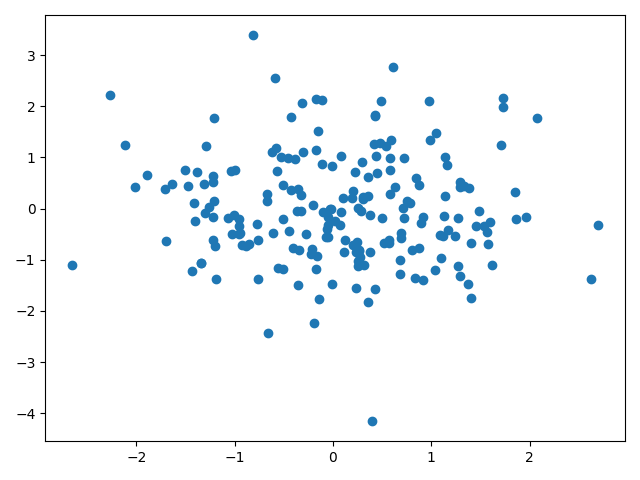
Scatter plot
You can use scatter instead of plot to generate a scatter plot.
df = pd.DataFrame(data=np.random.randn(200, 2),
                  columns=['A', 'B'])
fig = plt.figure()
ax = fig.add_subplot(111)
ax.scatter(df['A'], df['B'])
plt.show()
Change the size, style, and color of dots
Below is the code.
df = pd.DataFrame(data=np.random.randn(200, 2),
                  columns=['A', 'B'])
fig = plt.figure()
ax = fig.add_subplot(111)
ax.scatter(df['A'], df['B'], s=100, c='r', alpha=0.5)
ax.set_xlabel('$x_0$', fontsize=10)
ax.set_ylabel('$x_1$', fontsize=10)
ax.set_title('title')
plt.show()
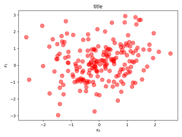
S in scatter sets the size of the point, c sets the color, and ʻalpha` sets the transparency.
Change the size and color of points according to the data
Below is the code.
df = pd.DataFrame(data=np.random.randn(200, 2),
                  columns=['A', 'B'])
df['data_size'] = np.random.randint(1, 100, 200)
fig = plt.figure()
ax = fig.add_subplot(111)
ax_cmap = ax.scatter(df['A'], df['B'], s=df['data_size']*10, c=df['data_size'], cmap='viridis', alpha=0.5)
fig.colorbar(ax_cmap)
ax.set_xlabel('$x_0$', fontsize=10)
ax.set_ylabel('$x_1$', fontsize=10)
ax.set_title('title')
plt.show()
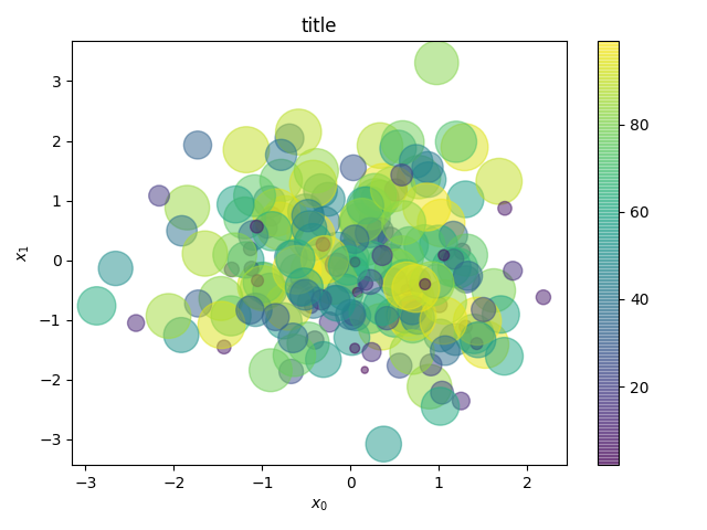
ʻAx.scatter` specifies data_size for c and viridis for cmap. viridis is a color map commonly used in matplotlib.
You can generate the right colorbar by passing the mappable object that created the colormap to fig.colorbar.
bar graph
Create a bar chart. Below is the code.
df = pd.DataFrame({'C1': ['A', 'A', 'A', 'B', 'B', 'C'],
                   'C2': [1, 2, 4, 5, 7, 7],
                   'C3': [1, 12, 7, 4, 8, 9]})
fig = plt.figure()
ax = fig.add_subplot(111)
ax.bar(df['C1'].value_counts().index, df.groupby('C1').sum()['C2'])
plt.show()
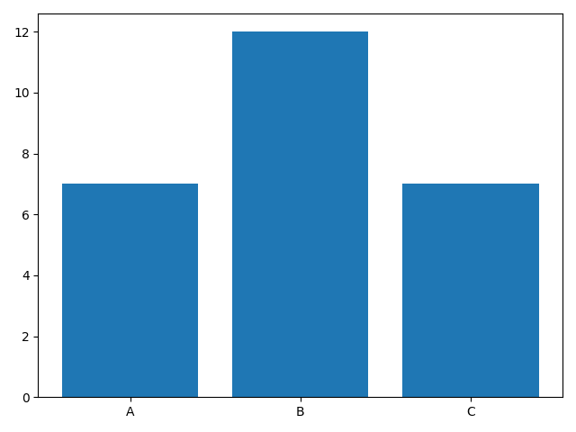
The index A, B, C of the C1 element is received by df ['C1']. value_counts (). Index.
By df.groupby ('C1'), we group by C1 element, calculate the sum by sum (), and receive the C2 element in it.
Create multiple bar charts
Generate multiple graphs as follows.
df = pd.DataFrame(data=100 * np.random.rand(5, 5), index=['A', 'B', 'C', 'D', 'E'],
                  columns=['C1', 'C2', 'C3', 'C4', 'C5'])

fig = plt.figure(figsize=(12, 8))
ax = fig.add_subplot(111)
x = np.arange(len(df))
bar_width = 0.4
ax.bar(x, df['C1'], color='b', width=bar_width, label='C1')
ax.bar(x + bar_width, df['C2'], color='r', width=bar_width, label='C2')
plt.xticks(x + bar_width/2, df.index, fontsize=20)
plt.legend()
plt.show()
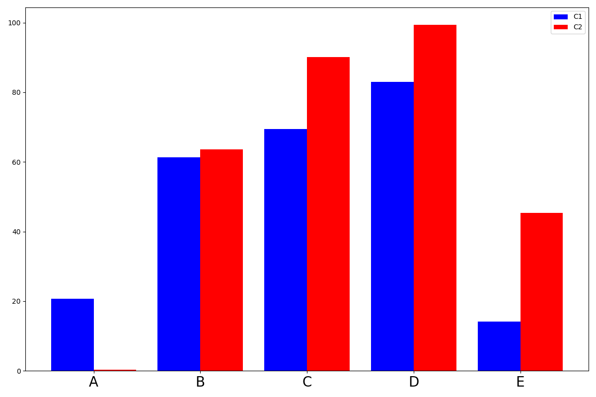
As arguments of ʻax.bar`, first give the value of x, then the value of y, color the bar color, width the width, and label the label.
xticks gave (x coordinate, name, fontsize = character size) as arguments.
histogram
Below is the code.
df = pd.DataFrame(data=np.random.randn(200), columns=['A'])
fig = plt.figure(figsize=(12, 8))
ax = fig.add_subplot(111)
ax.hist(df['A'], bins=15, rwidth=0.8, color='b')
plt.show()
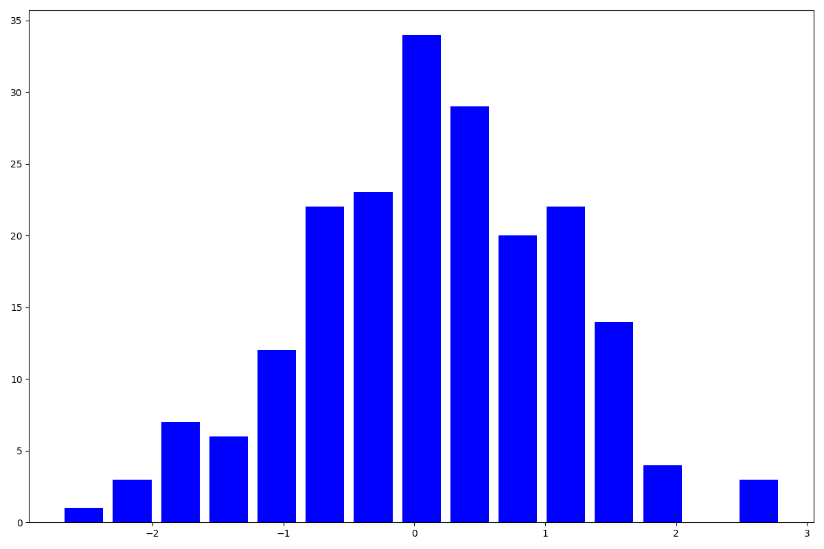 `rwidth` specifies the width of the bar, which is 1 by default. When it is 1, it overlaps with the horizontal bar, so this time I specified 0.8 to make it easier to see.
bins adjusts the number of bars in the histogram.
Heat map
Below is the code.
df = pd.DataFrame(data=np.random.rand(5, 5), columns=['A', 'B', 'C', 'D', 'E'])
fig = plt.figure(figsize=(12, 8))
ax = fig.add_subplot(111)
c_ax = ax.pcolor(df, cmap='Blues')
fig.colorbar(c_ax)
plt.show()
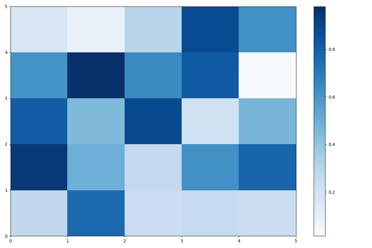
You can create a heatmap by using pcolor.
You can add a color bar by passing the return value after using pcolor to the argument of fig.colorbar.
About graph style
I referred to the article here.
x = np.linspace(0, 1, 100)
y = x ** 3
plt.rcParams["font.family"] = "arial"      #Set the entire font
plt.rcParams["xtick.direction"] = "in"               #Inward the x-axis scale line
plt.rcParams["ytick.direction"] = "in"               #Inward the y-axis scale line
plt.rcParams["xtick.minor.visible"] = True           #Addition of x-axis auxiliary scale
plt.rcParams["ytick.minor.visible"] = True           #Addition of y-axis auxiliary scale
plt.rcParams["xtick.major.width"] = 1.5              #Line width of x-axis main scale line
plt.rcParams["ytick.major.width"] = 1.5              #Line width of y-axis main scale line
plt.rcParams["xtick.minor.width"] = 1.0              #Line width of x-axis auxiliary scale line
plt.rcParams["ytick.minor.width"] = 1.0              #Line width of y-axis auxiliary scale line
plt.rcParams["xtick.major.size"] = 10                #x-axis main scale line length
plt.rcParams["ytick.major.size"] = 10                #Length of y-axis main scale line
plt.rcParams["xtick.minor.size"] = 5                 #x-axis auxiliary scale line length
plt.rcParams["ytick.minor.size"] = 5                 #Length of y-axis auxiliary scale line
plt.rcParams["font.size"] = 14                       #Font size
plt.rcParams["axes.linewidth"] = 1.5                 #Enclosure thickness
fig = plt.figure(figsize=(12, 8))
ax = fig.add_subplot(111)
ax.plot(x, y)
ax.set_xlabel('X')
ax.set_ylabel('Y')
fig.savefig('test_5.png', bbox_inches="tight", pad_inches=0.05)  #Save image
plt.show()
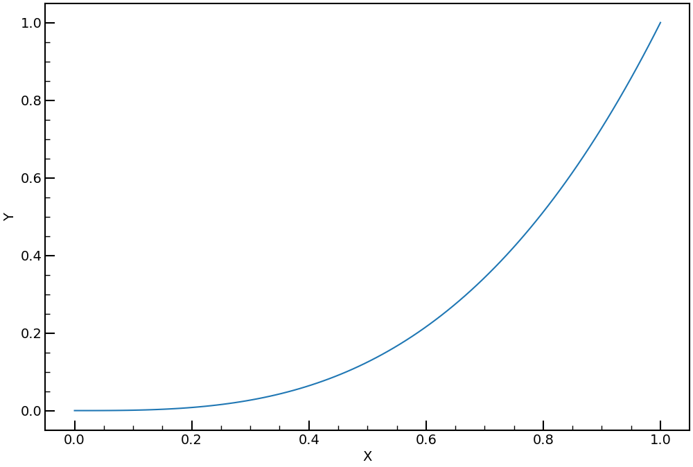
As shown above, plt.rcParams allows you to format the entire graph. Also, fig.savefig ('test_5.png', bbox_inches =" tight ", pad_inches = 0.05) allows you to save images with a good feeling.
At the end
That's all for this article.
As soon as I find other functions that I often use, I will add them to this article.
Thank you for staying with us so far.
Recommended Posts