[python] How to use the library Matplotlib for drawing graphs
[Reference] [Deep Learning from scratch (p130)](https://www.amazon.co.jp/%E3%82%BC%E3%83%AD%E3%81%8B%E3%82%89 % E4% BD% 9C% E3% 82% 8BDeep-Learning-% E2% 80% 95Python% E3% 81% A7% E5% AD% A6% E3% 81% B6% E3% 83% 87% E3% 82% A3% E3% 83% BC% E3% 83% 97% E3% 83% A9% E3% 83% BC% E3% 83% 8B% E3% 83% B3% E3% 82% B0% E3% 81% AE% E7% 90% 86% E8% AB% 96% E3% 81% A8% E5% AE% 9F% E8% A3% 85-% E6% 96% 8E% E8% 97% A4-% E5% BA% B7% E6% AF% 85 / dp / 4873117585)
In deep learning experiments Graph drawing and data visualization are important. With Matplotlib, a library for drawing graphs You can easily draw graphs and visualize data.
Basic usage of Matplotlib.
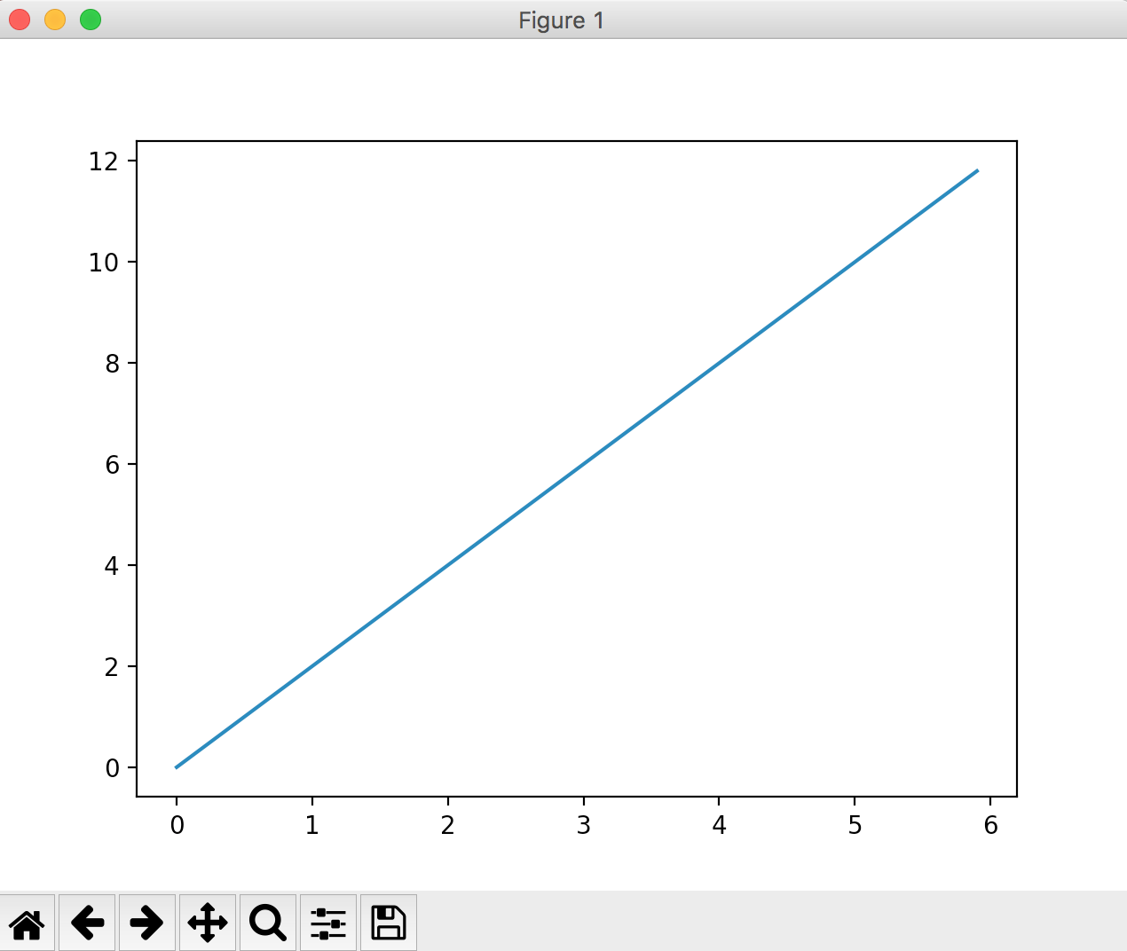
Using "y = 2x" as an example, specify the following values for drawing.
import numpy as np
import matplotlib.pyplot as plt

#Specifying the drawing range
# x = np.arange(x-axis minimum,Maximum x-axis,Notched)
x = np.arange(0, 6, 0.1)

#a formula
y = 2 * x

#Variables on the horizontal axis. Variables on the vertical axis.
plt.plot(x, y)

#Draw execution
plt.show()
It is drawn and output as follows.
Try changing the formula
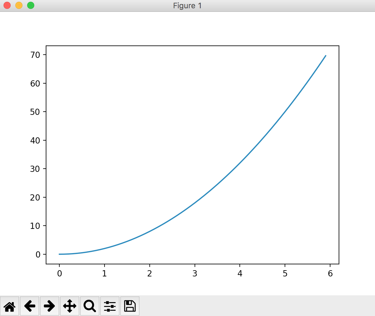
Actually draw a graph of a calculation formula other than "y = 2x". If you change the "# calculation formula" part of the code, the graph will change.
When "y = 2 * (x ** 2)"
import numpy as np
import matplotlib.pyplot as plt

x = np.arange(0, 6, 0.1)

#a formula
y = 2 * (x**2)

plt.plot(x, y)
plt.show()
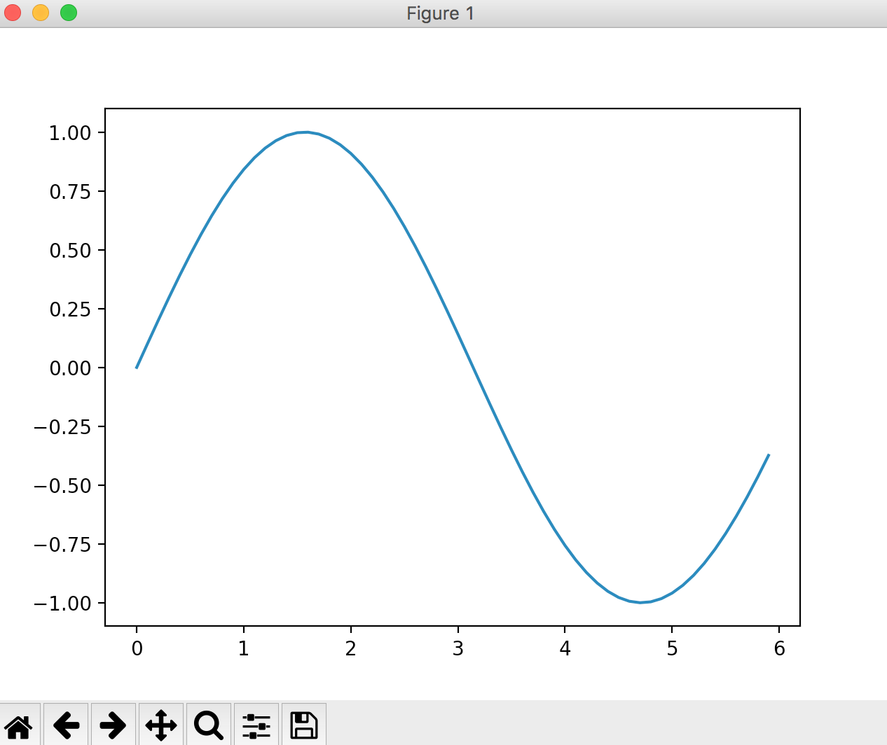
When "y = sin (x)"
#a formula
y = np.sin(x)
Try changing the drawing range.
In the examples so far, the drawing range is set to np.arange (0, 6, 0.1).
The calculation formula is y = np.sin (x), and try changing the drawing range.
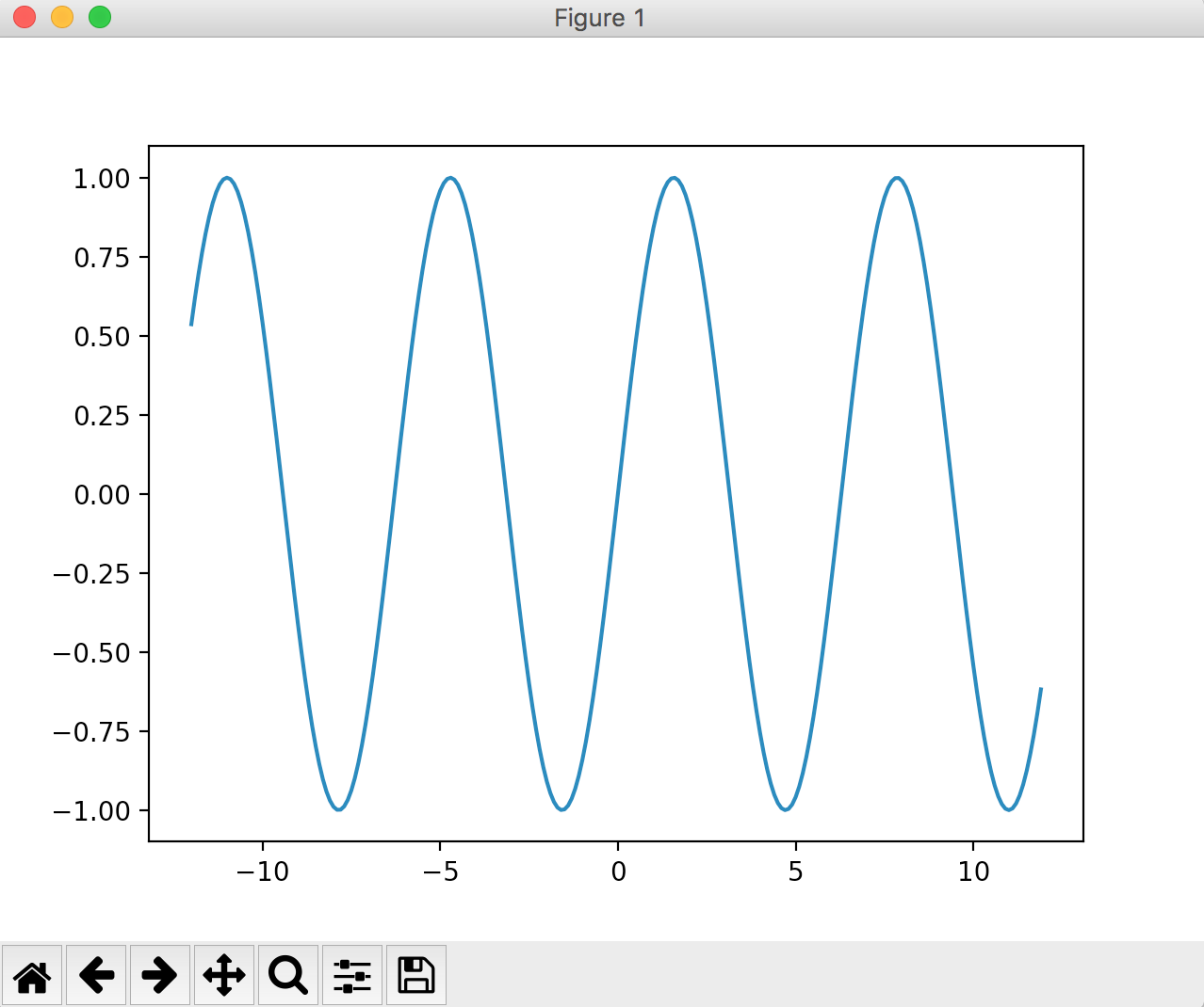
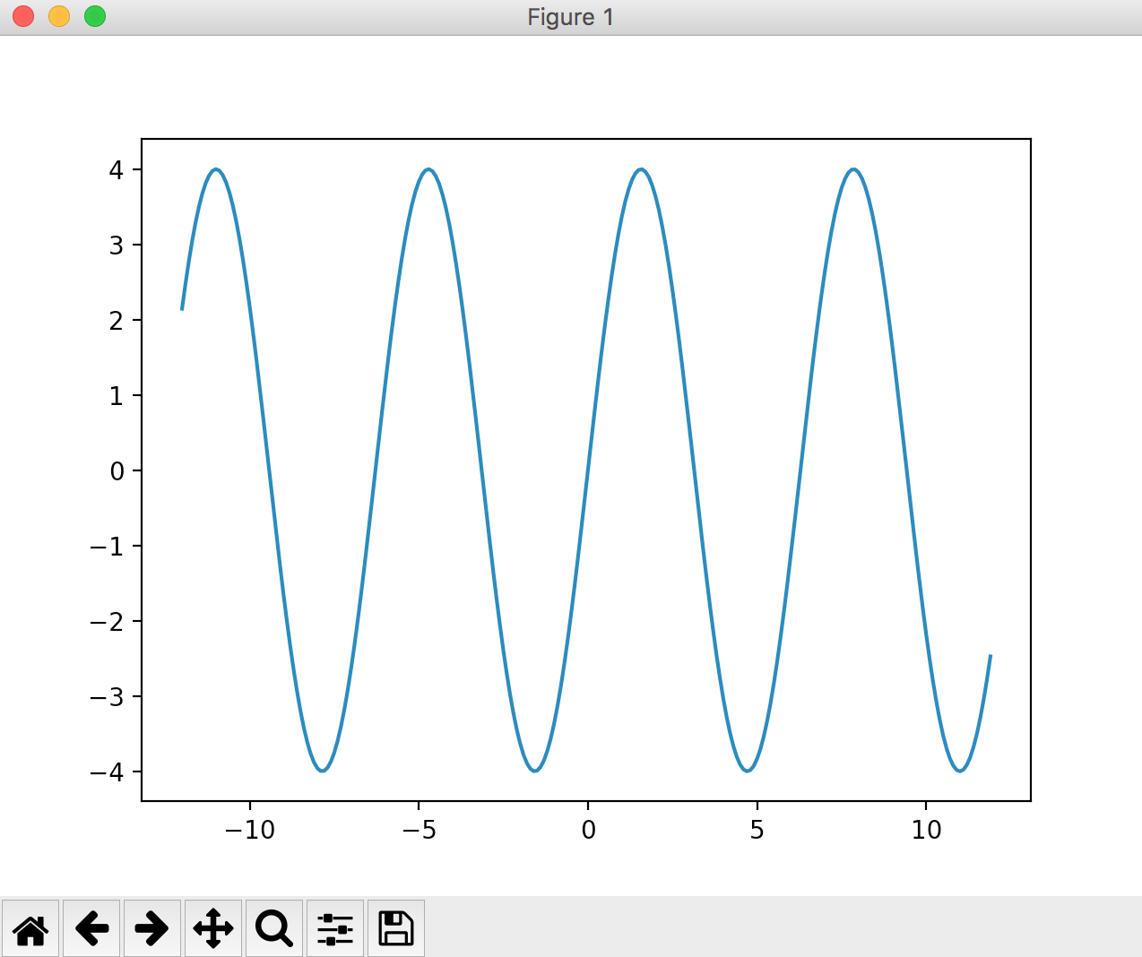
Draw a range of x-axis (-12 ~ + 12)
x = np.arange(-12, 12, 0.1)
By the way,
When specifying with arange, the y-axis is automatically set by the value, so
Simply setting the formula to y = 4 * np.sin (x) will expand the y-axis range as shown below.
When you want to fix the drawing range of the y-axis
In the following implementation, the y-axis varies depending on the value of y.
import numpy as np
import matplotlib.pyplot as plt

x = np.arange(0, 6, 0.1)
y = np.sin(x)
plt.plot(x, y)

plt.show()
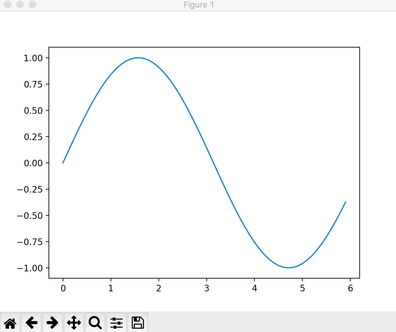
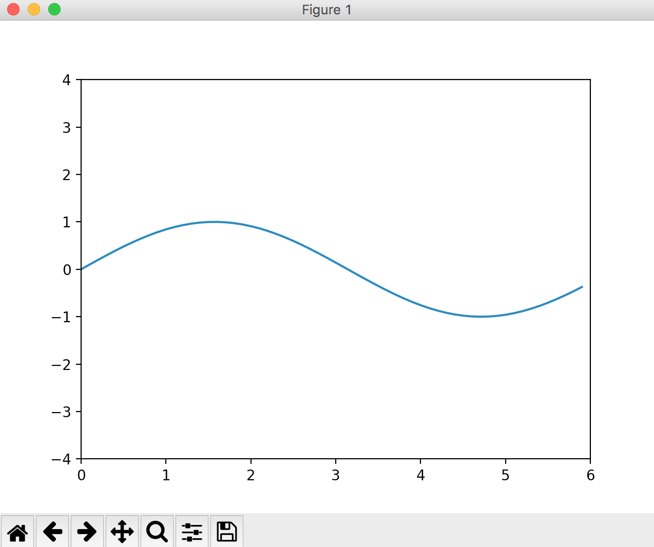
If you want to fix the y-axis range, Specify the y-axis drawing range with ylim. There is also an xlim that fixes the x-axis range.
import numpy as np
import matplotlib.pyplot as plt

x = np.arange(0, 6, 0.1)
y = np.sin(x)
plt.plot(x, y)

plt.ylim([-4,4])
plt.show()
Try changing the notch
When drawing the following y = np.sin (x),
The drawing range was specified by np.arange (0, 6, 0.1).
"Numeric increment" can be specified by the third argument of ʻarange`.
In this example, it is drawn in 0.1 increments.
import numpy as np
import matplotlib.pyplot as plt

x = np.arange(0, 6, 0.1)
y = np.sin(x)
plt.plot(x, y)
plt.show()

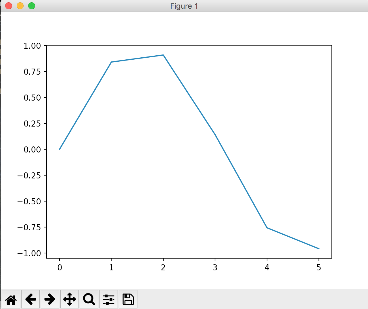
If this is set in 0.5 increments, it will be as follows. The drawing looks like a square.
x = np.arange(0, 6, 0.5)
When drawing two graphs
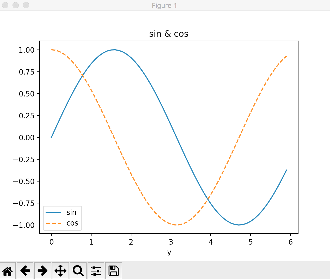
Draw sin and cos functions at the same time.
import numpy as np
import matplotlib.pyplot as plt

#Specifying the drawing range
x = np.arange(0, 6, 0.1)

#a formula
y1 = np.sin(x)
y2 = np.cos(x)

#Graph drawing settings
plt.plot(x, y1, label="sin") #Label "sin" is added to the y1 graph.
plt.plot(x, y2, linestyle="--", label="cos") #Label "cos" is added to the y2 graph. Specify the line style with linestyle.
plt.xlabel("x")
plt.xlabel("y")
plt.title('sin & cos')

#Label drawing
plt.legend()
#Graph drawing execution
plt.show()
Recommended Posts