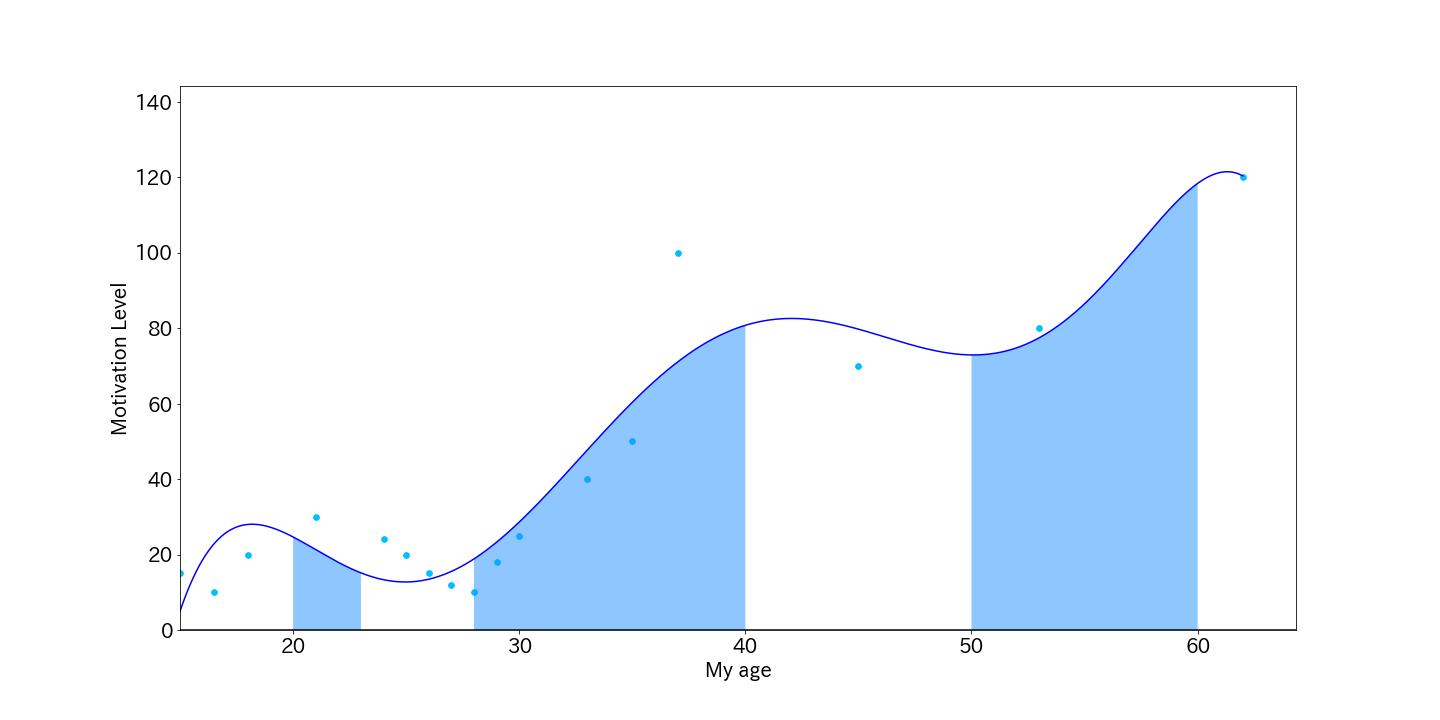
Try to draw a life curve with python
As the title says.
The life curve is a time-series review of your own experiences. It is plotted with the x-axis as age and the y-axis as motivation (happiness, fulfillment).
Next, pay attention to where the y-axis goes up and down. By repeating why this happened, you can understand your essential values.
To use the code described, modify the data of x and y according to your own experience.
Look for the order in which a graph such as "Oh, yeah, like this" is output.
lifeCurve
import numpy as np
import matplotlib.pyplot as plt

x = np.array([15.0, 16.5, 18.0, 21, 24.0, 25, 26, 27, 28, 29, 30, 33, 35, 37, 45, 53, 62])
y = np.array([15.0, 10.0, 20.0, 30, 24.0, 20, 15, 12, 10, 18, 25, 40, 50, 100, 70, 80, 120])
xp = np.linspace(min(x), max(x), 1000)

plt.rcParams["font.size"] = 20
fx = np.poly1d(np.polyfit(x, y, 6)) #← The order is now 6. Adjust here.
fig, ax = plt.subplots(figsize=(20,10))
ax.plot(xp, fx(xp), '-', color='blue')
ax.scatter(x, y, color='deepskyblue', s=32)
ax.axhline([0], color='black')
ax.set_xlim(min(x), None)
ax.set_ylim(0, 1.2*max(y))
ax.set_ylabel('Motivation Level')
ax.set_xlabel('My age')

color = '#1e90ff'
p1 = np.linspace(20, 23)
ax.fill_between(p1, fx(p1), 0, facecolor=color, alpha=0.5)
p2 = np.linspace(28, 40)
ax.fill_between(p2, fx(p2), 0, facecolor=color, alpha=0.5)
p3 = np.linspace(50, 60)
ax.fill_between(p3, fx(p3), 0, facecolor=color, alpha=0.5)
fig.savefig('./data/img/lifeCurve.png'))

Recommended Posts