Data analysis starting with python (data visualization 2)
Introduction
Explains data analysis with python for beginners. This article is the second one.
Previous article: Data analysis starting with python (data visualization 1) https://qiita.com/CEML/items/d673713e25242e6b4cdb
Source code https://gitlab.com/ceml/qiita/-/blob/master/src/python/notebook/first_time_data_analysis.ipynb
Last review
In this series We will explain from reading data to simple data analysis using a dataset that is open to the public for free.
About the dataset
・ Provided by: California Institute of Technology ・ Contents: Test data of heart disease patients ・ URL: https://archive.ics.uci.edu/ml/datasets/Heart+Disease -Use only processed.cleveland.data in the above URL.
Analysis purpose
The dataset classifies the patient's condition into five classes. I will proceed with the analysis for the purpose of grasping the characteristics of each class.
* Please refer to past articles for downloading and reading data. </ font>
Contents of this article
Improves the histogram that was hard to see last time.
Remedy
The plot of the previous problem was shown below.
import pandas as pd

columns_name = ["age", "sex", "cp", "trestbps", "chol", "fbs", "restecg", "thalach", "exang", "oldpeak","slope","ca","thal","class"]
data = pd.read_csv("/Users/processed.cleveland.data", names=columns_name)

class_group = data.groupby("class")
class_group["age"].hist(alpha=0.7)
plt.legend([0,1,2,3,4])

There are two possible reasons why it is difficult to see. ①. The figures overlap. ②. The range of bin is different for each class.
This time, we will improve these problems using plotly. Of course, matplotlib can solve the problem, but plotly is also convenient, so there is no loss in using it. The nice thing about plotly is that you can create interactive plots. * Since the figure was not embedded well this time, please click the image and experience the interactive operation at the link destination. </ font>
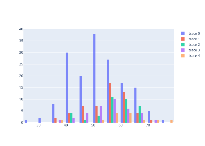
① Improvement measures
import plotly.graph_objects as go

fig = go.Figure()
for i in range(len(class_group)):
    fig.add_trace(go.Histogram(x=class_group["age"].get_group(i), nbinsx=10))

# fig.update_layout(barmode='overlay')
fig.update_traces(opacity=0.8)
fig.show()
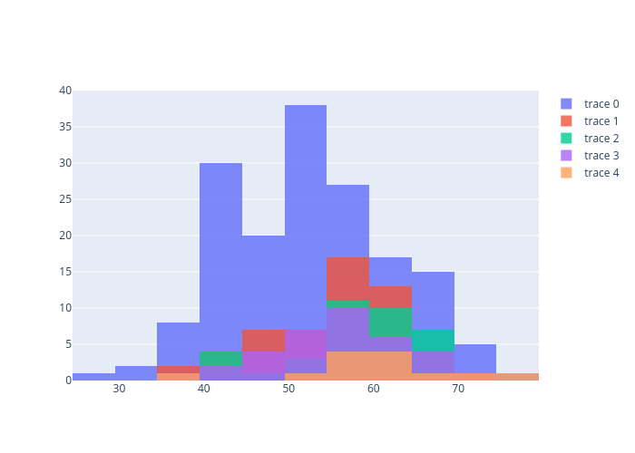
② Improvement measures
Just by turning on the comment out part earlier, the figure will be drawn.
import plotly.graph_objects as go
fig = go.Figure()
for i in range(len(class_group)):
    fig.add_trace(go.Histogram(x=class_group["age"].get_group(i), nbinsx=10))

fig.update_layout(barmode='overlay')
fig.update_traces(opacity=0.8)
fig.show()
At the end
Did you experience the interactive operation? Not only can you display the value of the data pointer, but you can also freely operate the figure to enlarge or reduce it, which is convenient. Next time, I would like to proceed with the analysis using plotly's 3d plot and so on.
Data analysis starting with python (data visualization 3) https://qiita.com/CEML/items/71fbc7b8ab6a7576f514
Recommended Posts