How to visualize where misclassification is occurring in data analysis classification
Identify where the misclassification occurred to improve the accuracy of your data analysis results
That is the theme of this time.
So, today we will use the confusion matrix to visualize where the misclassification occurred.
from sklearn.tree import DecisionTreeClassifier
from sklearn.metrics import confusion_matrix

clf = DecisionTreeClassifier()

clf.fit(X_train, Y_train)
result = clf.predict(X_test)
cm = confusion_matrix(Y_test, result)

print(cm)
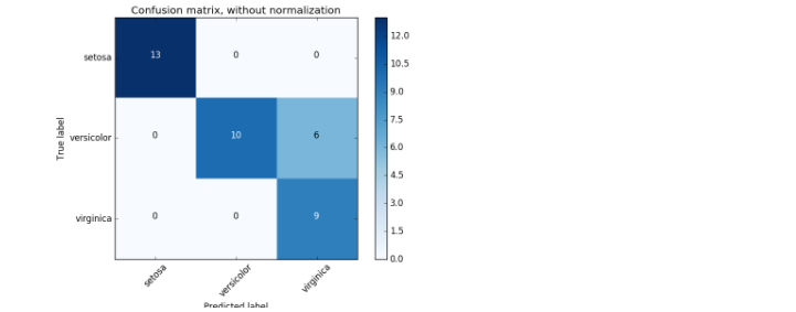
If you use the iris dataset, it will be visualized as shown in the figure below.
 Extracted from sklearn Official Document
It's a bit small and hard to see, but the y-axis is True value, that is, the correct labeling, the x-axis is Predicted value, and it's labeled using a machine learning model. Looking at the above figure, misclassification occurs in the center line and on the right.
Recognizing this, you may be able to improve the accuracy by reviewing the data preprocessing and readjusting the parameters of the machine learning model.
Recommended Posts