I drew a heatmap with seaborn [Python]
I practiced drawing a heat map using experimental data.
Import of matplotlib, seaborn, pandas
import matplotlib.pyplot as plt
import pandas as pd
import seaborn as sns```
 Ready with the above code.
## Data reading

#### **`ec_am = pd.read_csv('./ec_am.csv')`**
Data is 6 rows and 10 columns

Creating a heat map
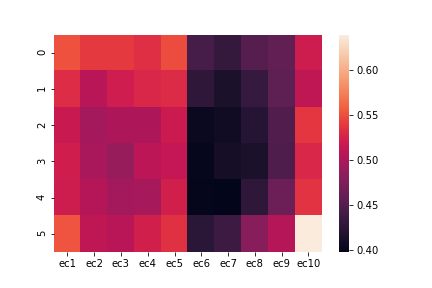
First, try without specifying any conditions.
heatmap1 = sns.heatmap(ec_am)
plt.savefig("heatmap1.png ")```
Save the figure in png format named heatmap1 with plt.savefig ("heatmap1.png "). The save destination is the same file as the open jupyter notebook.
Next, try various conditions.
#### **`heatmap2 = sns.heatmap(ec_am, yticklabels=False, cbar=False)`**
```heatmap(ec_am, yticklabels=False, cbar=False)
plt.savefig("heatmap2.png ")```
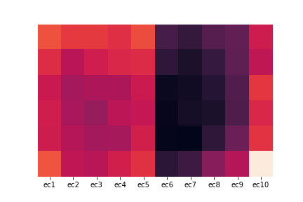
Specify Y-axis labels with yticklabels. Specify the color bar with cbar. If it is False, it disappears.
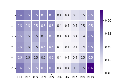
#### **`heatmap3 = sns.heatmap(ec_am, cmap="Wistia", annot=True, fmt="1.2f")`**
plt.savefig("heatmap3.png ")```
 Specify the color with cmap. Display the numerical value of the data with annot. Display up to the xth decimal place with fmt = "1.xf" (x is a positive integer).
See beiz notes for color types.
Specify the color with cmap. Display the numerical value of the data with annot. Display up to the xth decimal place with fmt = "1.xf" (x is a positive integer).
See beiz notes for color types.
heatmap4 = sns.heatmap(ec_am, cmap="Purples", annot=True, fmt="1.1f", linewidths=.5)
plt.savefig("heatmap4.png ")```
Draw lines between cells with linewidths (thickness 0.5 in this case).
Recommended Posts