Create an age group with pandas
The values aggregated for each year are summarized for each 10 years.
Set the class with cut of pandas and aggregate with groupby.
- pandas.cut — pandas 0.15.1 documentation
- pandas.DataFrame.groupby — pandas 0.15.1 documentation
- Group By: split-apply-combine — pandas 0.15.1 documentation
The data used is the CSV format of the Excel of "Population by Age" published by the Statistics Bureau of the Ministry of Internal Affairs and Communications.
- Statistics Bureau Homepage / 64th Japan Statistical Yearbook 2015-Chapter 2 Population / Household
- → 2 -7 Population by age (Excel: 42KB)
For ease of use, delete the description line at the top of the data, the note at the bottom, and the "100+" and "Unknown" lines. The adjusted file is population-by-age.csv.
Processed with pandas
First, load the numpy and pandas modules.
I also added a setting to draw a graph in IPython.
import numpy as np
import pandas as pd
import matplotlib.pyplot as plt
pd.options.display.mpl_style = 'default'
Read the CSV file. Specify the first column as the index. After reading, check the data type.
df = pd.read_csv('population-by-age.csv', index_col='age')
print df.dtypes
y1920    int64
y1930    int64
y1940    int64
y1950    int64
y1960    int64
y1970    int64
y1980    int64
y1990    int64
y2000    int64
y2010    int64
dtype: object
In addition, let's check the beginning, end, and statistics. The display is omitted.
print df.head(3)
print df.tail(3)
print df.describe()
Use cut to set the class.
If you want to change the class width, adjust the third argument of range. Include or do not include both ends of the class is specified as an option. Switch between the * include_lowest * and * right * options accordingly.
- labels * sets the string for display. If the mathematical expression of closed interval / open interval is easier to understand, it can be left unspecified.
labels = [ "{0} - {1}".format(i, i + 9) for i in range(0, 100, 10) ]
c = pd.cut(df.index, np.arange(0, 101, 10),
           include_lowest=True, right=False,
           labels=labels)

print df.groupby(c).sum()
            y1920     y1930     y1940     y1950     y1960     y1970     y1980
0 - 9    14314635  16778220  17961607  20728122  17049068  16965066  18547450
10 - 19  11520624  13340649  15816378  17267585  20326076  16921989  17231873
20 - 29   8533259  10367140  11756837  13910662  16527810  19749434  16882381
30 - 39   7020188   7798498   9370143  10250310  13555835  16578939  19973312
40 - 49   5902331   6332741   7041270   8487529   9835689  13217564  16427887
50 - 59   4074855   5046797   5446760   6137697   7842597   9230197  12813527
60 - 69   2968342   2977915   3782574   4074610   5092019   6709761   8429928
70 - 79   1378630   1478319   1541314   1967261   2518482   3401952   5059662
80 - 89    236419    315624    338472    354836    638738    879221   1503633
90 - 99     13657     13997     18567     16258     32043     65629    118391

            y1990     y2000     y2010
0 - 9    13959454  11925887  10882409
10 - 19  18533872  14034777  11984392
20 - 29  16870834  18211769  13720134
30 - 39  16791465  16891475  18127846
40 - 49  19676302  16716227  16774981
50 - 59  15813274  19176162  16308233
60 - 69  11848590  14841772  18247422
70 - 79   6835747  10051176  12904315
80 - 89   2665908   4147012   6768852
90 - 99    286141    688769   1318463
So, I was able to aggregate the values aggregated for each year of age every 10 years.
Aggregate functions can be specified in addition to sum, and multiple aggregate functions can be specified.
Let's check the following results.
print df.groupby(c).agg(['count', 'min', 'max', 'mean', 'std'])
Graph drawing
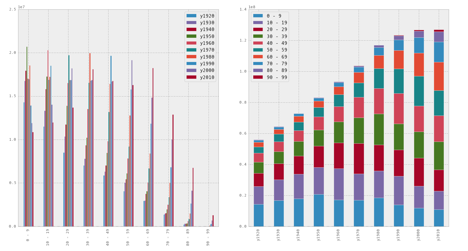
Since it is difficult to understand the relationship with only the above numbers, make a graph to get an overview of the numbers. Try arranging them side by side to compare the * stacked * options when drawing.
fig, axes = plt.subplots(ncols=2)
df.groupby(c).sum().plot(kind='bar', ax=axes[0])
df.groupby(c).sum().T.plot(kind='bar', stacked=True, ax=axes[1])

Looking at the numbers by 10 years old, the population over 60 years old is increasing more recently. On the other hand, we can see that the youth population is declining. If you look at the stacked graphs, you can see that the population has been steadily increasing from 1920 to 2000, but has been declining through 2010. As for the generation distribution, the ratio of the upper part of the bar in the graph is increasing.
Now that we've aggregated the general trends, we'll draw each series in the original data frame. If you simply plot it, it will be messy, so let's draw it as a separate graph for each year. This time the ʻaxes` variable is two-dimensional, so be careful when specifying the array index.
fig, axes = plt.subplots(nrows=5, ncols=2)
for i, y in enumerate(['y1920', 'y1930', 'y1940', 'y1950', 'y1960']):
    df[y].plot(ax=axes[i, 0])
    axes[i, 0].set_title(y)
    if y != 'y1960':
        axes[i, 0].get_xaxis().set_visible(False)
for i, y in enumerate(['y1970', 'y1980', 'y1990', 'y2000', 'y2010']):
    df[y].plot(ax=axes[i, 1])
    axes[i, 1].set_title(y)
    if y != 'y2010':
        axes[i, 1].get_xaxis().set_visible(False)

If you look at the individual graphs, you can see the impact of the baby boom. You can also see that the number of births has decreased since the second baby boom, and that the base of the elderly has expanded (lifespan has been extended) since 1970.
Recommended Posts