I created a stacked bar graph with matplotlib in Python and added a data label
Try drawing a stacked bar graph with matplotlib
motivation
When drawing a stacked bar graph in Python, I wish I could display the data label like Excel, and when I looked it up, there was no article that could display the data label, and there was no code that I could copy and paste. So, I wrote a code that I can copy and paste when I want to add a data label to the stacked bar graph.
By the way, if you only need to draw a stacked bar graph, please refer to ** Easy to draw a stacked bar graph ** at the end of this page.
import
Import the following libraries.
import pandas as pd
import numpy as np
import matplotlib.pyplot as plt
import seaborn as sns

sns.set(font='IPAexGothic')

%matplotlib inline
Creating dummy data
Dummy data created monthly sales data for A, B, and C branches.
dataset = pd.DataFrame([[100, 200, 50], [300, 400, 600], [50, 300, 60]],
                       columns=['Branch A', 'B branch', 'C branch'],
                       index=['April', 'May', 'June'])
| Branch A | B branch | C branch | |
|---|---|---|---|
| April | 100 | 200 | 50 |
| May | 300 | 400 | 600 |
| June | 50 | 300 | 60 |
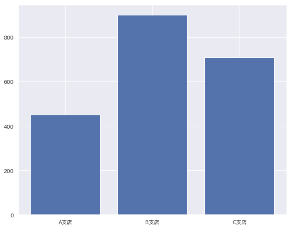
Draw a bar graph
First, let's draw a simple bar graph. Let's draw a bar graph that totals the monthly sales of each branch. It's good to draw, but with this alone, I don't know how much sales each month. .. .. In such a case, let's use a stacked bar graph!
fig, ax = plt.subplots(figsize=(10, 8))
ax.bar(dataset.columns, dataset.sum())
plt.show()
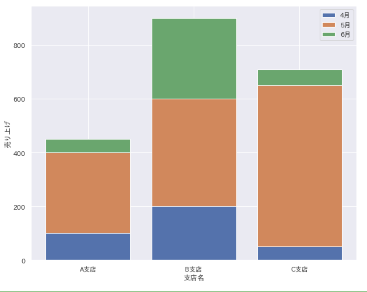
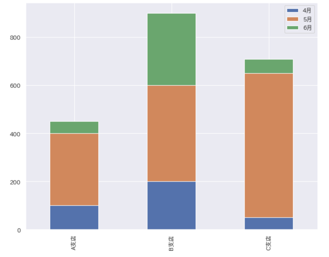
Draw a stacked bar graph
Stacked bar charts use ʻax.bar () as you would when drawing a bar chart. Specify the y coordinate that is the base of the bar in the argument bottom` at this time.
You now have a stacked bar chart! !! !! After all, I want a data label.
Reference site: https://matplotlib.org/3.1.1/api/_as_gen/matplotlib.axes.Axes.bar.html
fig, ax = plt.subplots(figsize=(10, 8))
for i in range(len(dataset)):
    ax.bar(dataset.columns, dataset.iloc[i], bottom=dataset.iloc[:i].sum())
ax.set(xlabel='Branch name', ylabel='Sales')
ax.legend(dataset.index)
plt.show()
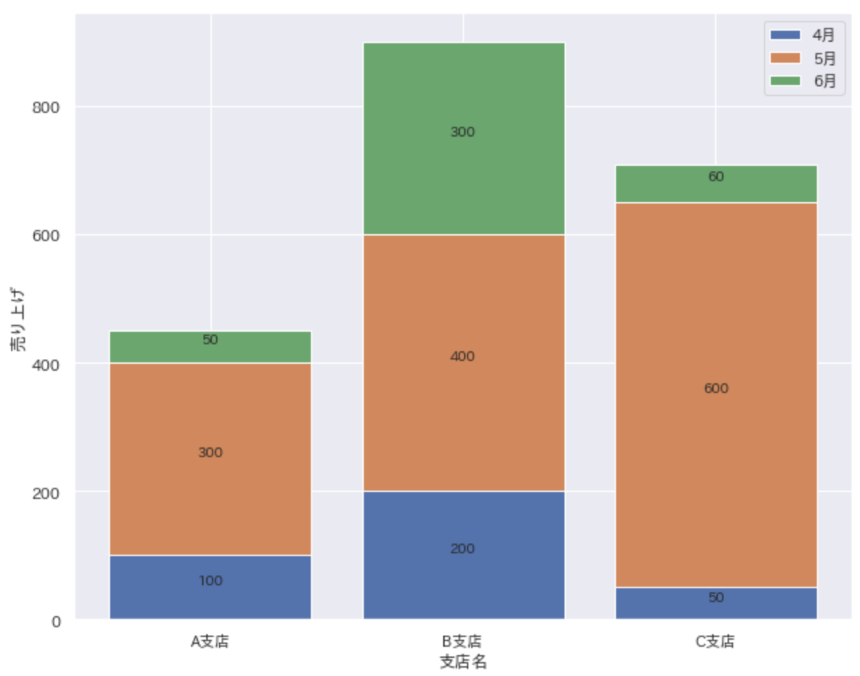
Display data labels in stacked bar charts
The main subject is finally from here.
Insert the data label by specifying the x and y coordinates with plt.text ().
Then I got a good feeling!
fig, ax = plt.subplots(figsize=(10, 8))
for i in range(len(dataset)):
    ax.bar(dataset.columns, dataset.iloc[i], bottom=dataset.iloc[:i].sum())
    for j in range(len(dataset.columns)):
        plt.text(x=j,
                 y=dataset.iloc[:i, j].sum() + (dataset.iloc[i, j] / 2),
                 s=dataset.iloc[i, j],
                 ha='center',
                 va='bottom'
                )
ax.set(xlabel='Branch name', ylabel='Sales')
ax.legend(dataset.index)
plt.show()
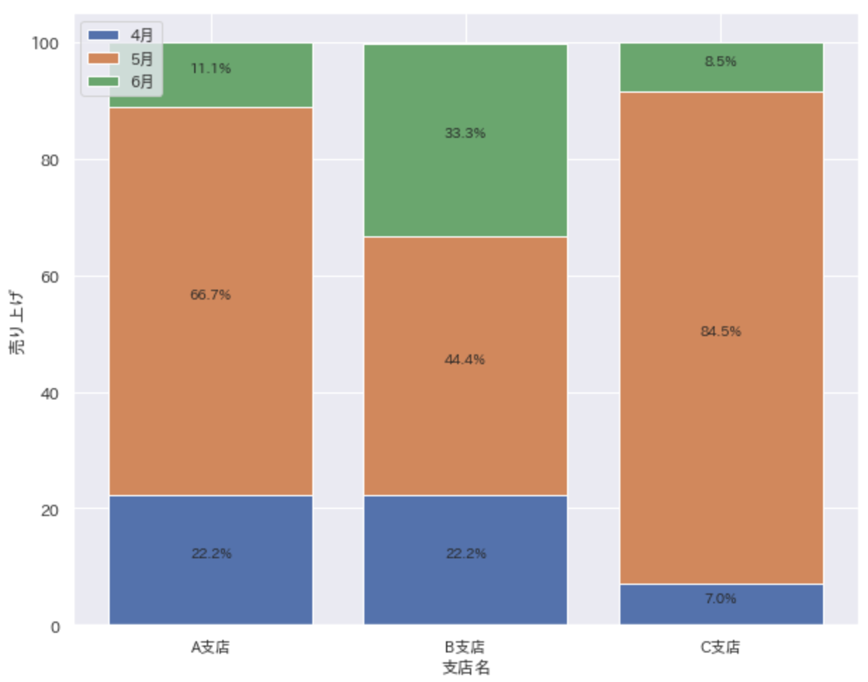
Draw a 100% stacked bar graph
When you use a stacked bar chart, you also want to use a 100% stacked bar chart. First, process the data. The following code converts sales by branch into percentages.
plot_dataset = pd.DataFrame(index = dataset.index)
for col in dataset.columns:
    plot_dataset[col] = round(100 * dataset[col] / dataset[col].sum(), 1)
| Branch A | B branch | C branch | |
|---|---|---|---|
| April | 22.2 | 22.2 | 7.0 |
| May | 66.7 | 444. | 84.5 |
| June | 11.1 | 33.3 | 8.5 |
Draw a 100% stacked bar chart using the converted data. The code is the same as the previous code. (Only variables are changed.)
fig, ax = plt.subplots(figsize=(10, 8))
for i in range(len(plot_dataset)):
    ax.bar(plot_dataset.columns,
           plot_dataset.iloc[i],
           bottom=plot_dataset.iloc[:i].sum()
          )
    for j in range(len(plot_dataset.columns)):
        plt.text(x=j,
                 y=plot_dataset.iloc[:i, j].sum()+(plot_dataset.iloc[i, j]/2),
                 s=f'{plot_dataset.iloc[i, j]}%',
                 ha='center',
                 va='bottom'
                )
ax.set(xlabel='Branch name', ylabel='Sales')
ax.legend(plot_dataset.index)
plt.show()
Easily draw stacked bar charts
If you just want to draw a stacked bar graph, you can easily draw it with the following code.
fig, ax = plt.subplots(figsize=(10, 8))
dataset.T.plot(kind='bar', stacked=True, ax=ax)
plt.show()
Recommended Posts